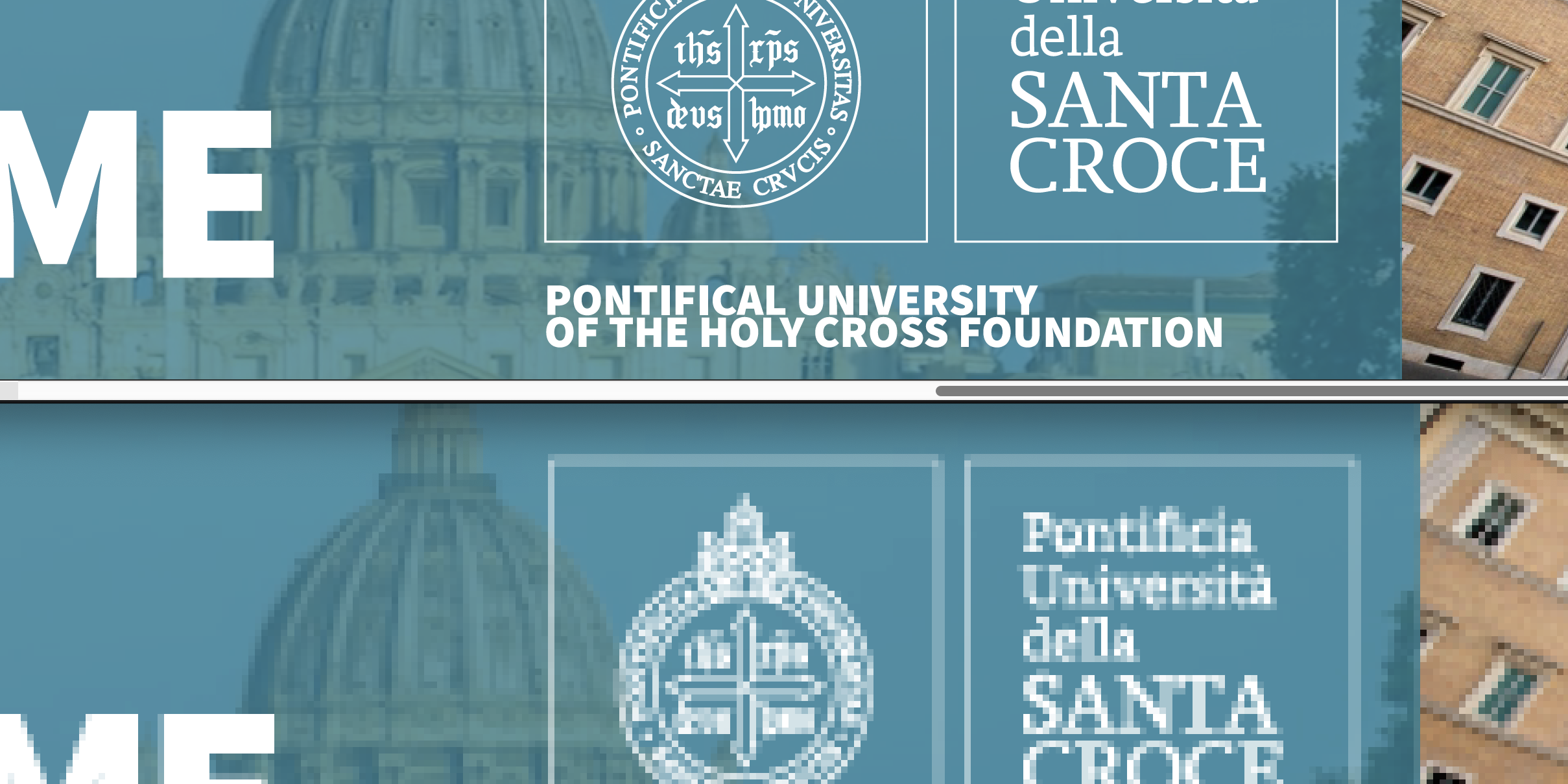
Over the years, I’ve had numerous clients reach out with a similar frustration: their logo, which looks perfect in print and on larger formats, appears pixelated and blurry when used online, particularly in web banners or digital ads. These logos often have beautifully intricate designs, with thin lines and fine details that perfectly capture the essence of their brand. However, when these logos are resized for digital spaces, they lose their clarity, leaving clients puzzled and concerned about how their brand is being represented online.
This is a common issue for many businesses, especially those with logos designed to be detailed and elegant. The problem typically arises when these logos are used in standard web formats like .PNG and .JPG. If you’ve faced this issue, you’re not alone. Let’s explore why this happens and how you can mitigate the impact of pixelation on your logo’s appearance.
The Problem: Pixelation and Blurriness in Online Advertising
When it comes to online advertising, .PNG and .JPG are the standard file formats. These are pixel-based or raster images, meaning they are made up of a grid of individual pixels. While these formats work well for many types of images, they can present challenges when used with logos that have thin lines or intricate details.
- Resolution Shrinkage:
Logos are often designed at larger sizes with high resolution, ensuring every detail is crisp and clear. However, when these logos are saved as a .PNG or .JPG and resized for smaller spaces like web banners, the resolution decreases. This reduction in resolution means fewer pixels are available to display the logo, causing the thin lines and complex details to become blurry or pixelated. - Pixel Density and Raster Image Limitations:
Unlike vector images, which use mathematical equations to create smooth lines at any size, raster images like .PNG and .JPG rely on a fixed number of pixels. For logos with fine details, this can be problematic. As these logos are shrunk down for web use, there simply aren’t enough pixels to maintain the sharpness of those details, leading to a jagged or fuzzy appearance. - Complexity of Design:
Logos with intricate designs and thin lines are especially vulnerable to these issues. What looks stunning in a high-resolution vector format may lose its impact when converted to a .PNG or .JPG for web use. The details become too small for the pixel grid to accurately render, resulting in a logo that looks less polished and professional.
The Solution: Mitigating the Impact of Pixelation
While it’s challenging to completely eliminate pixelation issues with thin-lined, complex logos in online formats, there are several strategies you can use to mitigate the problem and ensure your logo still represents your brand effectively.
- Work with a Designer to Ensure the Highest Quality Source Files:
The first step is to work closely with your designer to ensure that your logo’s source files are of the highest possible quality. High-resolution vector files (like those in Adobe Illustrator or SVG formats) are essential as they allow for crisp scaling and resizing without loss of quality. This foundation ensures that any rasterized versions of your logo are created from the best possible starting point. - Simplify the Design:
Consider simplifying your logo for smaller applications. This might involve thickening the lines or reducing the number of intricate details. A cleaner, more straightforward design can often translate better in .PNG or .JPG format, ensuring your logo remains legible and sharp even in smaller spaces. - Create a Scalable Version:
Another option is to create different versions of your logo optimized for different sizes. For instance, you could have a more detailed version for larger applications and a simplified version for smaller ones. This approach helps maintain clarity and readability, regardless of the format or size. - Leverage Vector Formats Where Possible:
Whenever possible, use a vector format like SVG (Scalable Vector Graphics) for your logo. Unlike .PNG and .JPG, vector images are not made of pixels and can be scaled infinitely without losing quality. This ensures your logo remains crisp and clear, whether it’s blown up to the size of a billboard or shrunk down for a web banner. Unfortunately, not all online platforms support vector formats, which is why having well-optimized raster versions is still essential. - Understand the Limitations and Trust the Process:
It’s important to recognize that this issue is not unique to your brand—many digital advertisements experience the same challenges due to the limitations of .PNG and .JPG formats. In truth, while you might notice the slight pixelation or blurriness, most of your audience likely won’t. Digital advertising is consumed quickly, and the majority of viewers are focused on the overall message rather than scrutinizing every detail of a logo. Trust that your brand’s integrity will still shine through, even if the logo isn’t as razor-sharp as it is in print.
Final Thoughts
Your logo is a critical part of your brand identity, so it’s important to ensure it looks its best in every application. If you’ve noticed pixelation or blurriness when your logo is used in web banners or other small spaces, it’s likely due to the limitations of .PNG and .JPG formats. This is a challenge faced by many businesses, but with a few strategic adjustments and an understanding of the limitations, you can overcome it. Remember, most people won’t even notice the minor imperfections you’re concerned about.
